Fleming's Promotion Lightning Demo
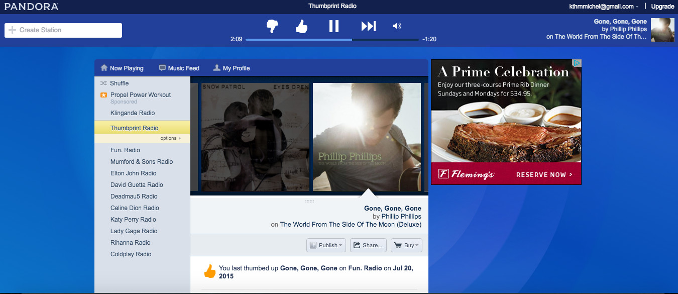
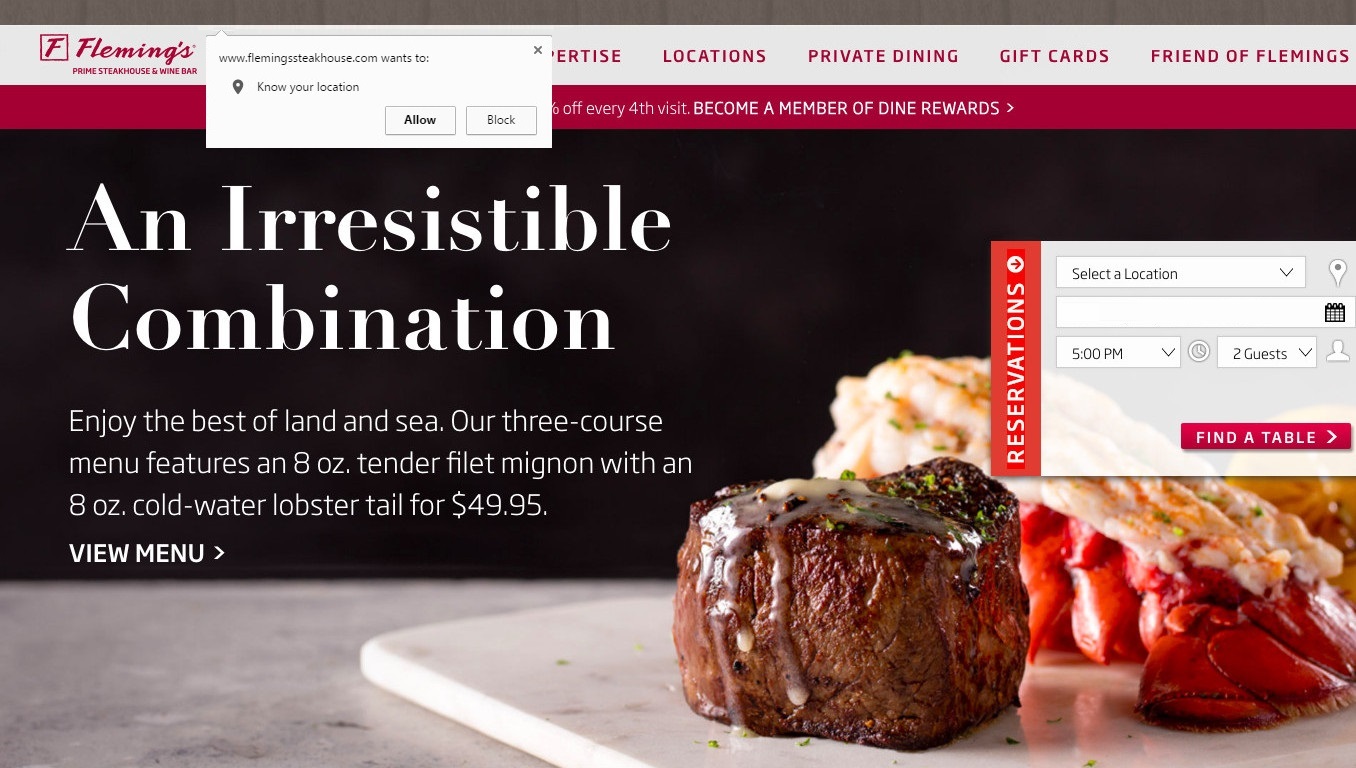
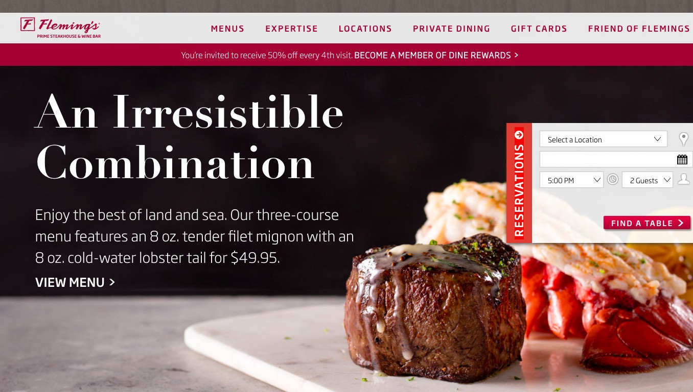
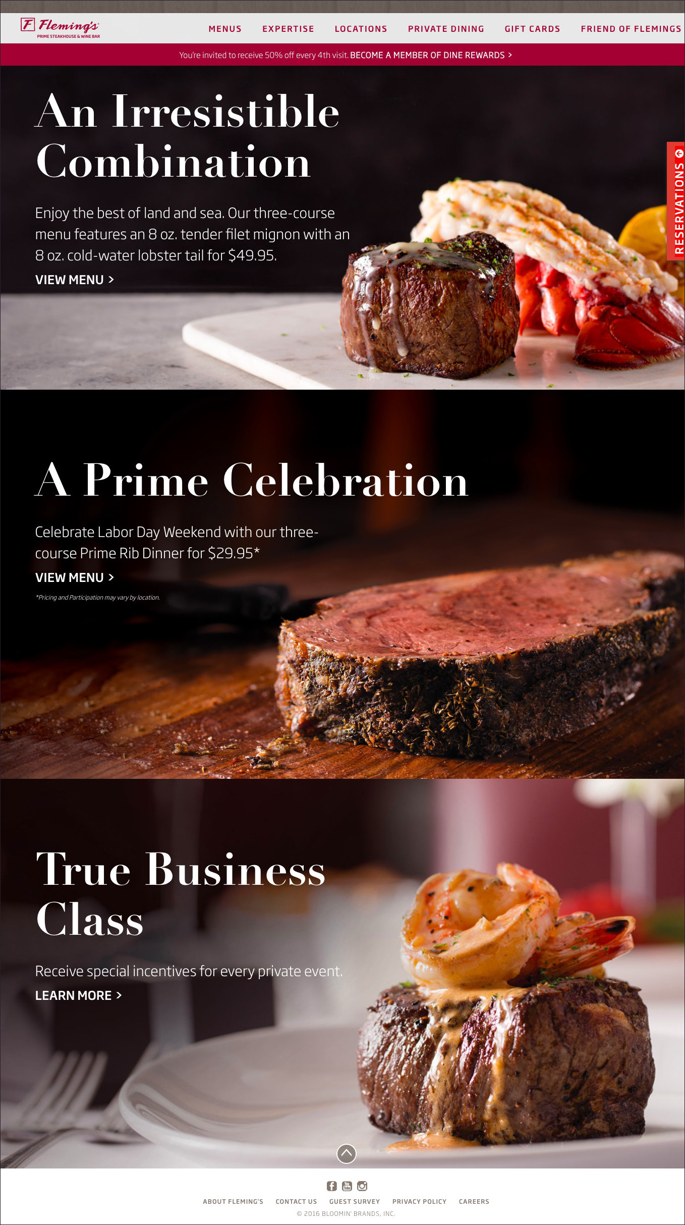
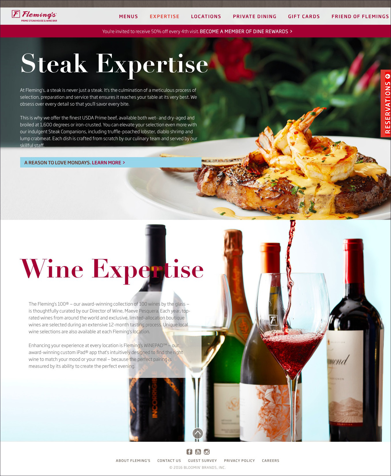
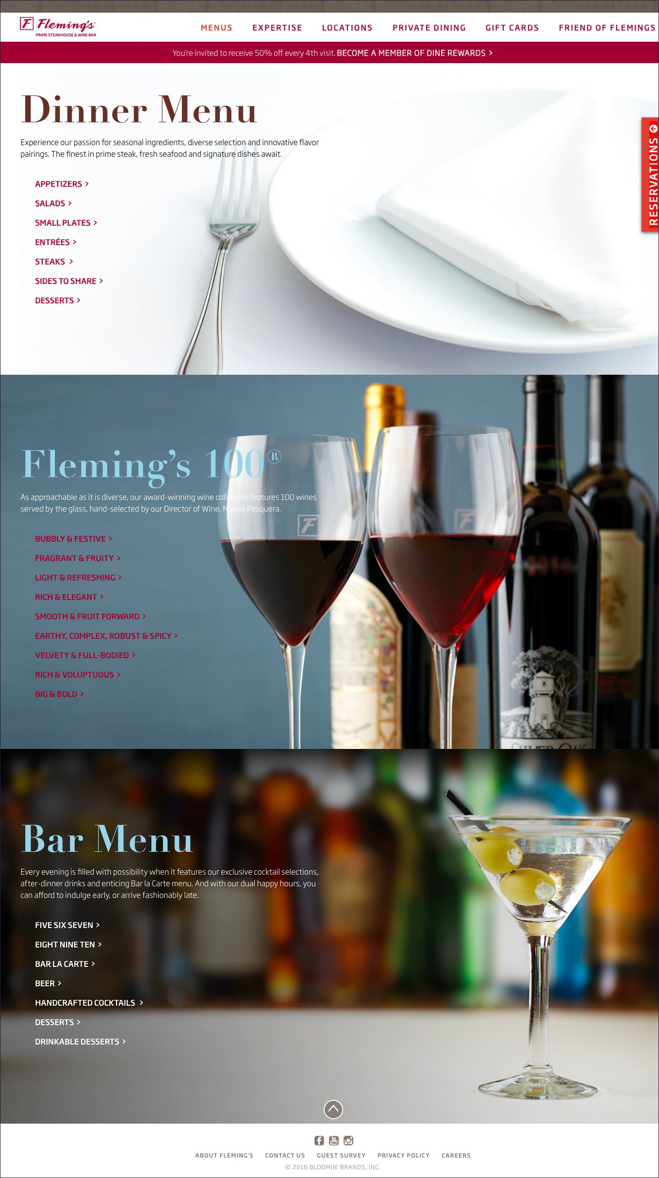
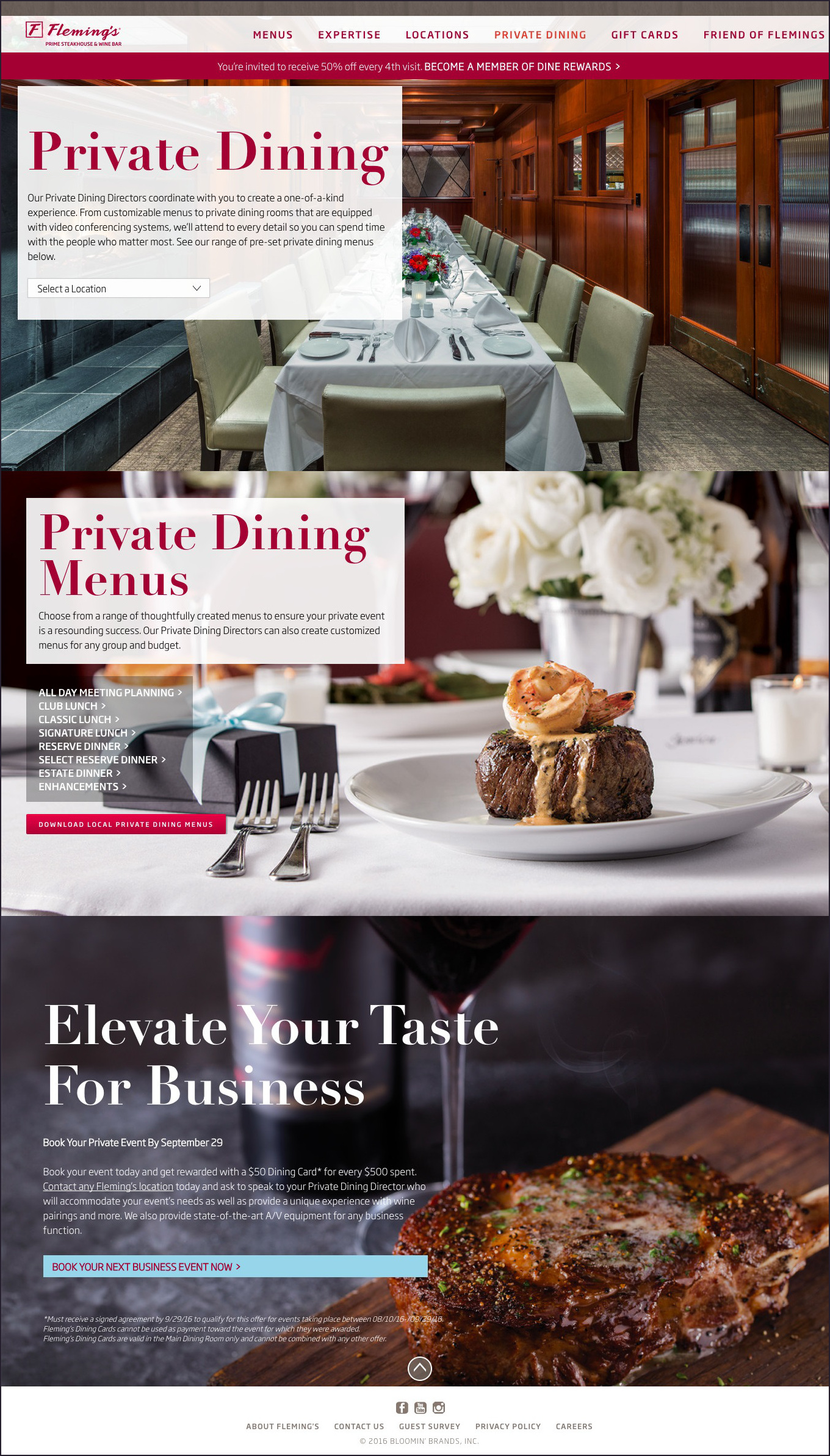
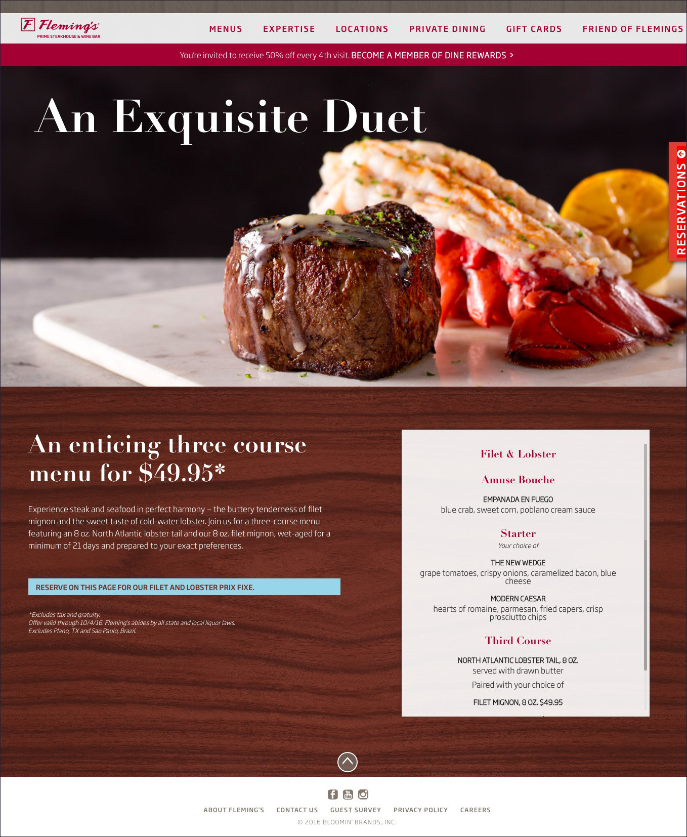
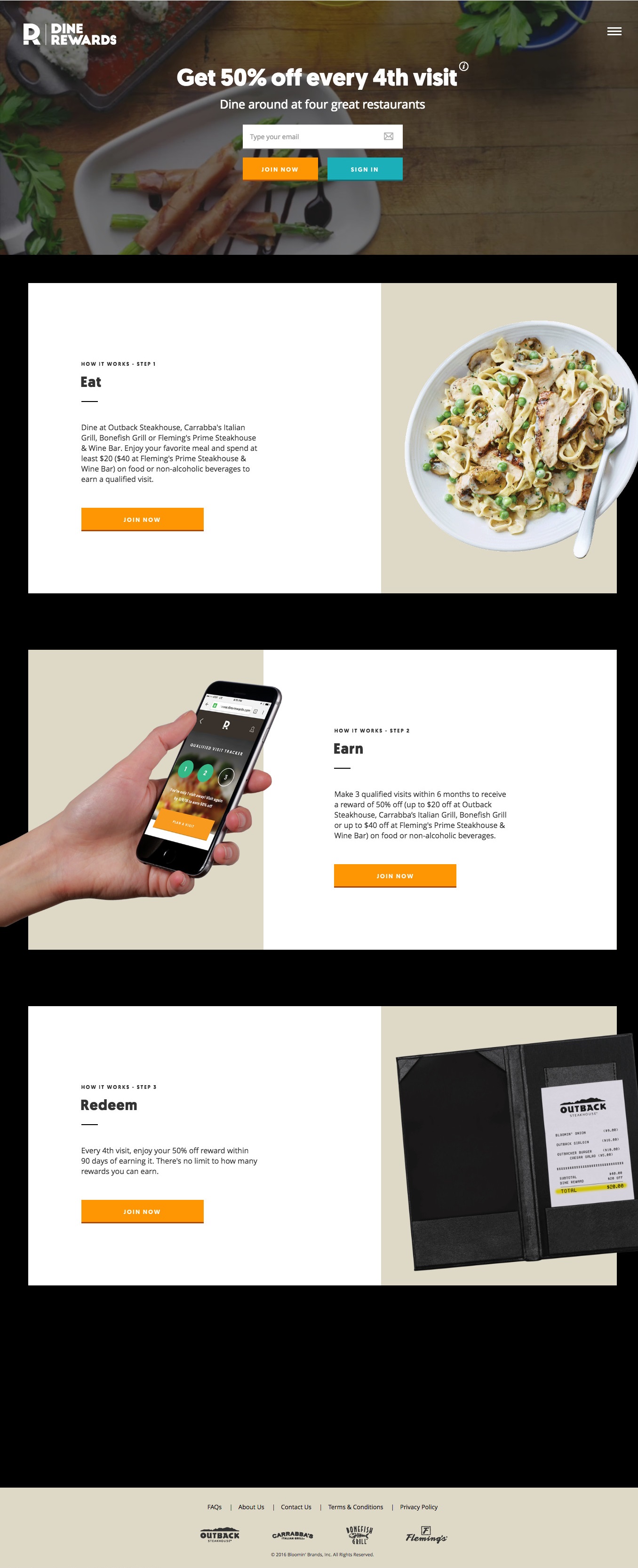
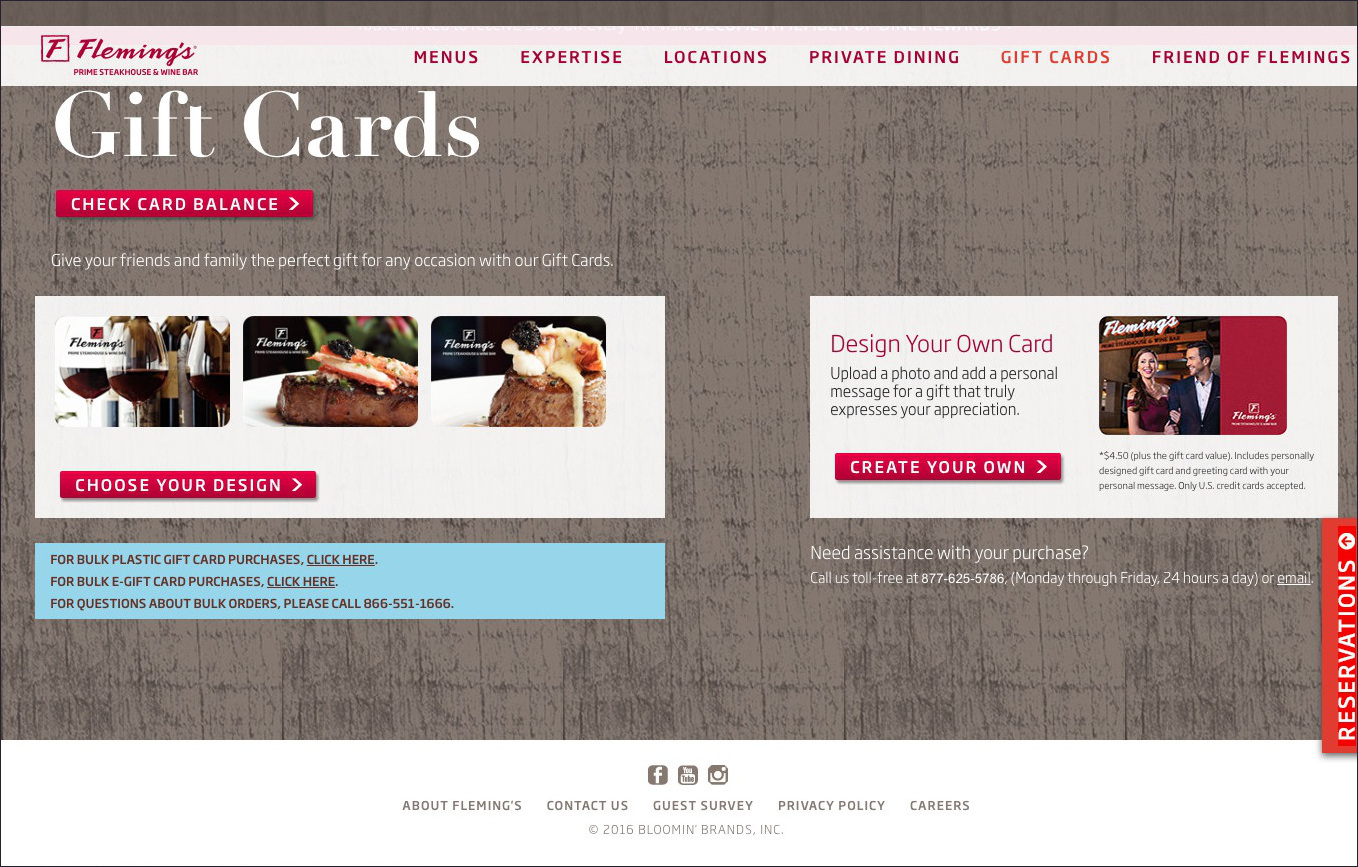
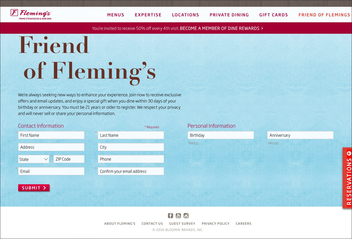
The Fleming's website has a pretty nice look to it. The design and content are sophisticated. The colors are bright and mostly attractive, and the layout is nice. The photo quality is a highlight. The full-screen product photos are excellent. One thing that sets this website is apart is promotion. The promotion is well done, starting on the homepage with a geolocation pop-up, an information bar at the top under the navigation bar, a slide-in panel on the right for making reservations, and product call outs with full-screen photo carousels as backgrounds, featuring the beautiful product photos I already mentioned. The site engages well with customers, offering special deals such as dine rewards, gift cards, Friend of Fleming's sign up, and an opportunity to give feedback through a guest survey. Also, soon after looking at the Fleming's website for the first time, I saw a targetted ad via another website.
My main quibble design wise is that the color scheme includes both fuschia and red (slide-in-panel, navigation bar link hover), and these are not "complimentary" colors. I feel the two colors clash because they are slightly different, but very close on the color wheel. Admittedly, this is a bit nit-picky and I'm sure there are others out there who would have a different opinion. Also, the wood paneling has a bit of a faux look about it, but is ok.
Geolocation
Reservations slide-in panel
Home with advertisements
Expertise
Menu
Advertisement
Advertisement
Advertisement
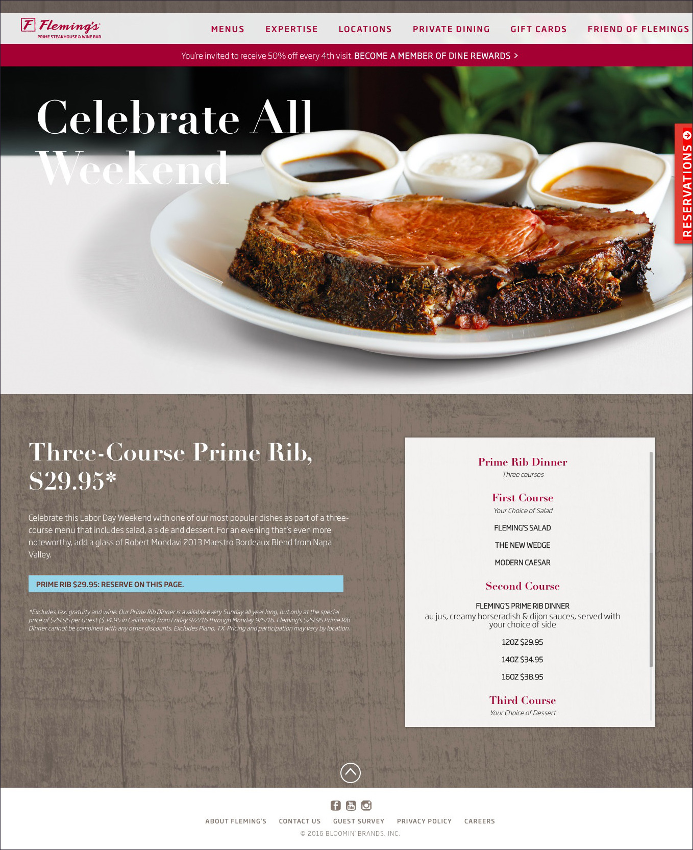
Dine rewards
Gift cards
Friend of Fleming's
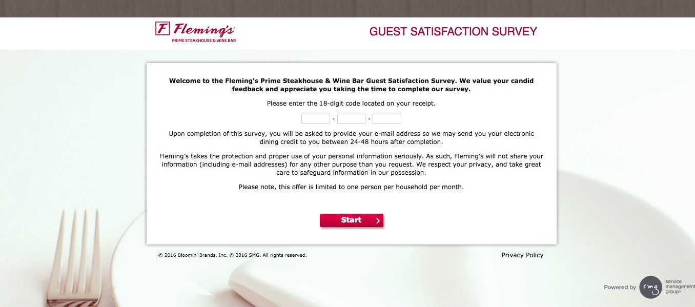
Guest satisfaction survey
Targeted ad
