Homepage Mockup Design Variations
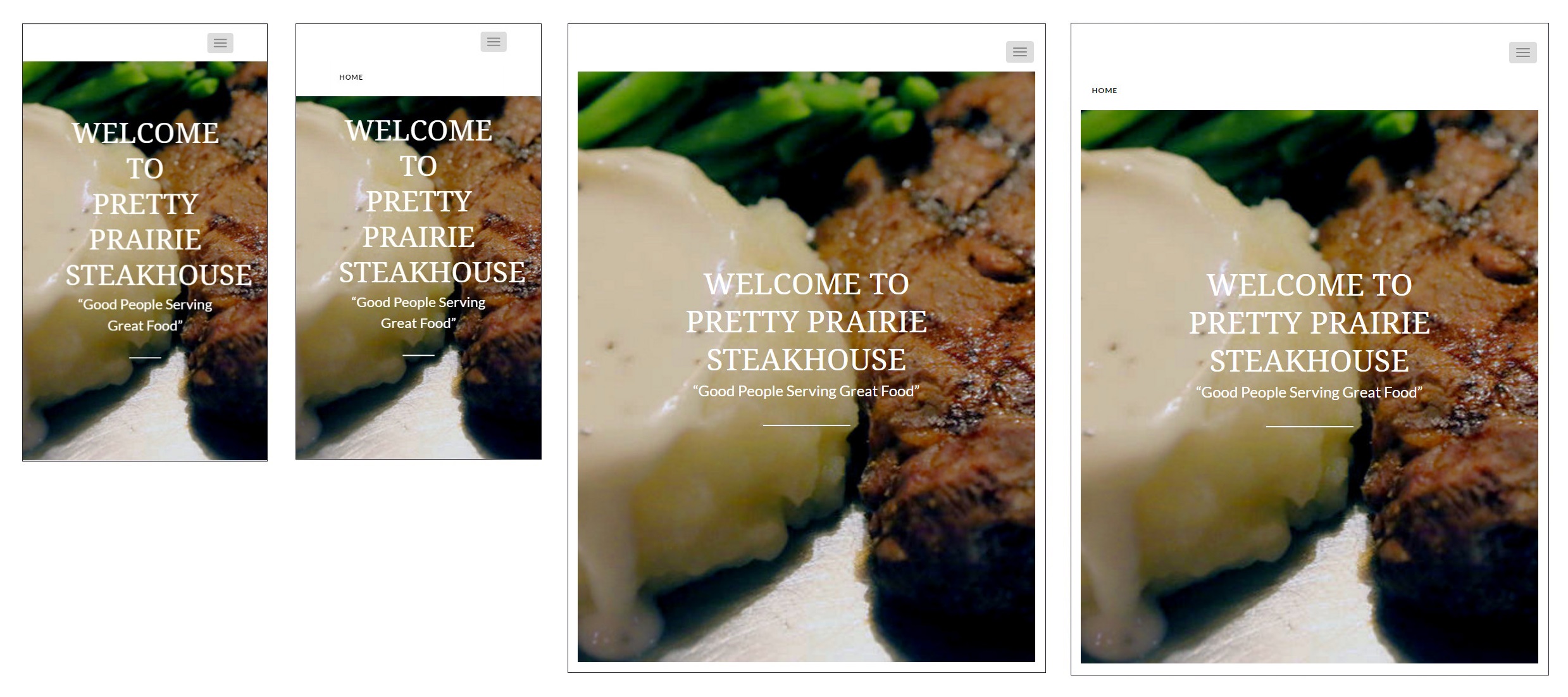
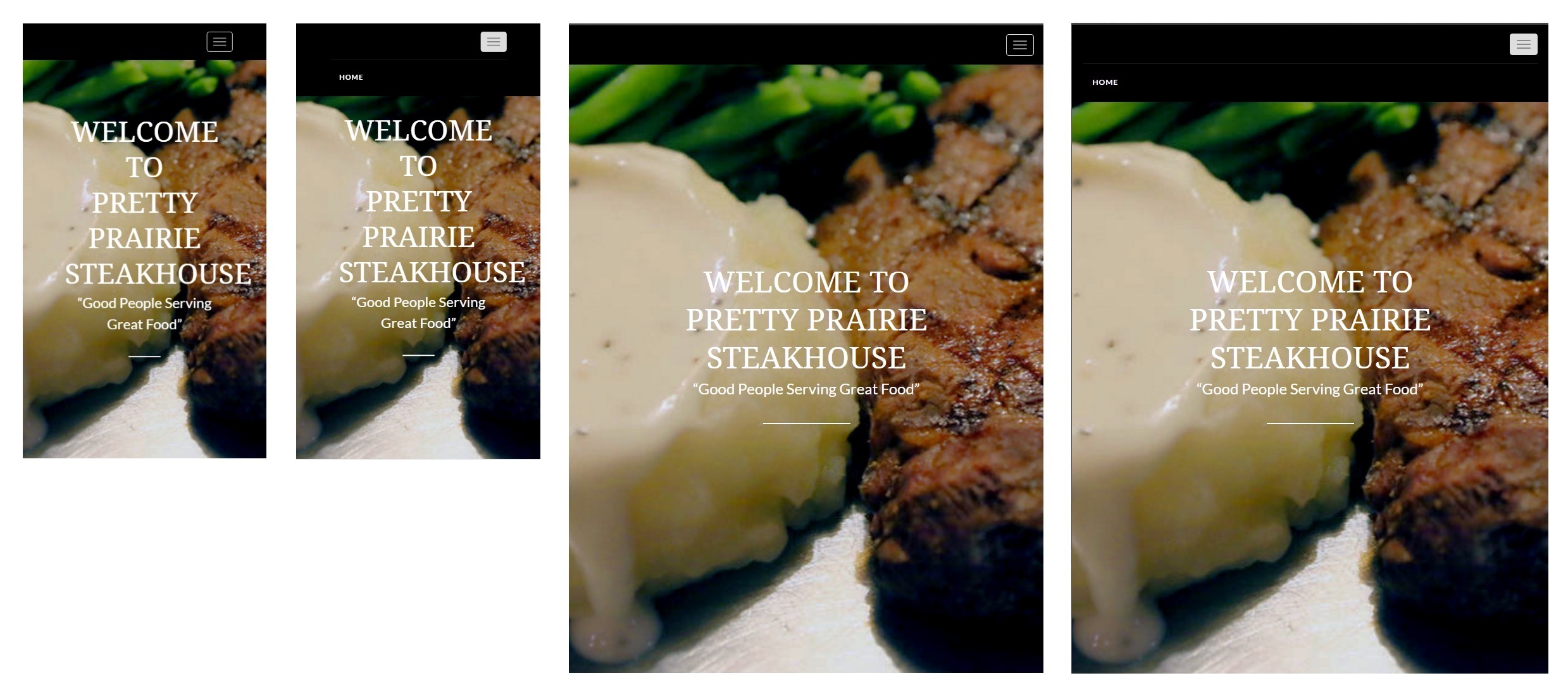
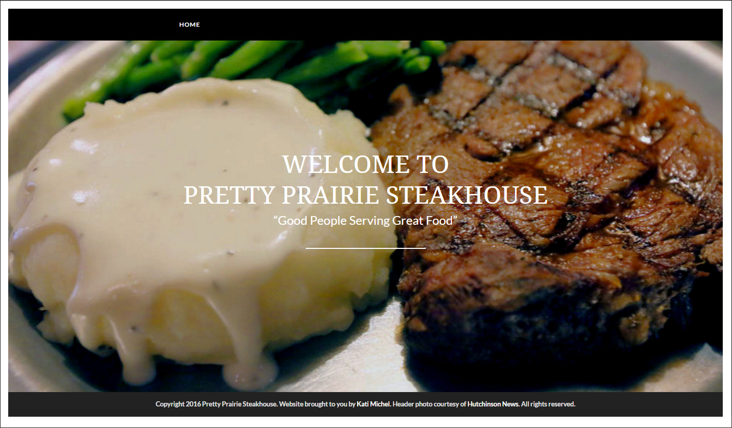
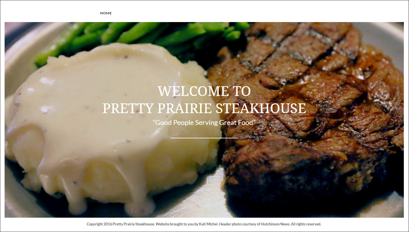
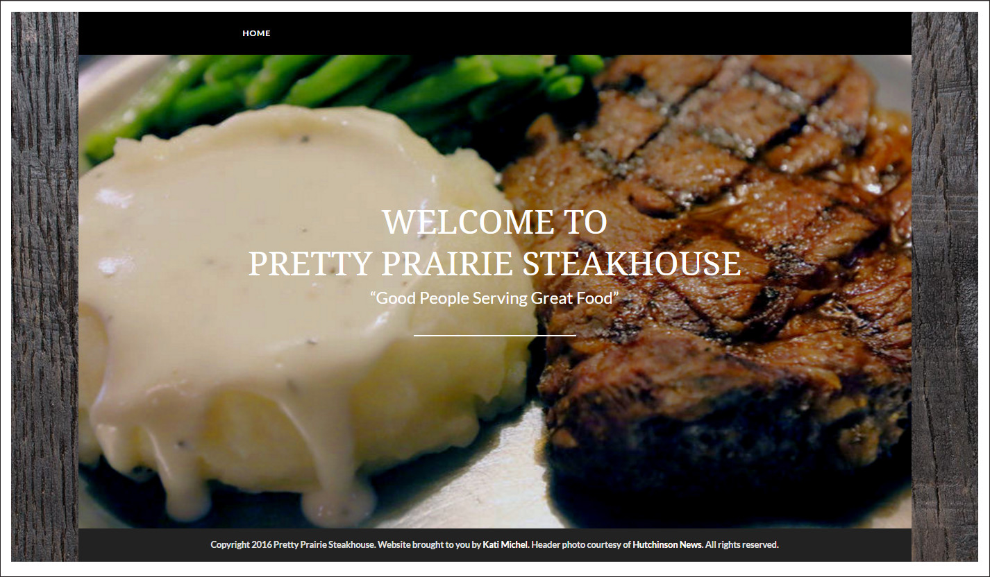
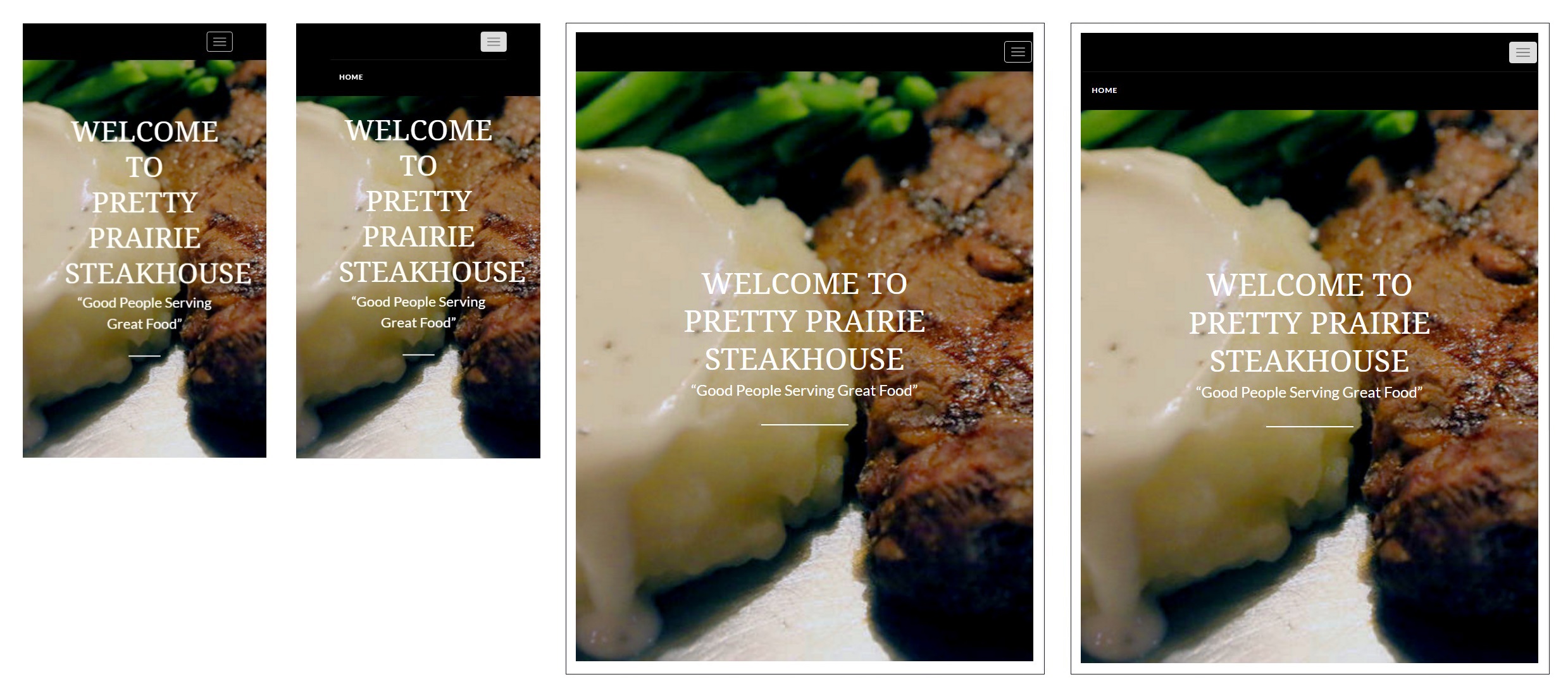
While choosing what I believe to be the optimal homepage design, I came up with a number of variations, at the request of the client. Frankly, I think all of these options are beautiful, and choosing one is difficult! Though I believe the black color theme is most fitting for the steakhouse, the white color theme offers a brighter option. One compromise would be to occasionally change the color theme or layout, for instance, by season.
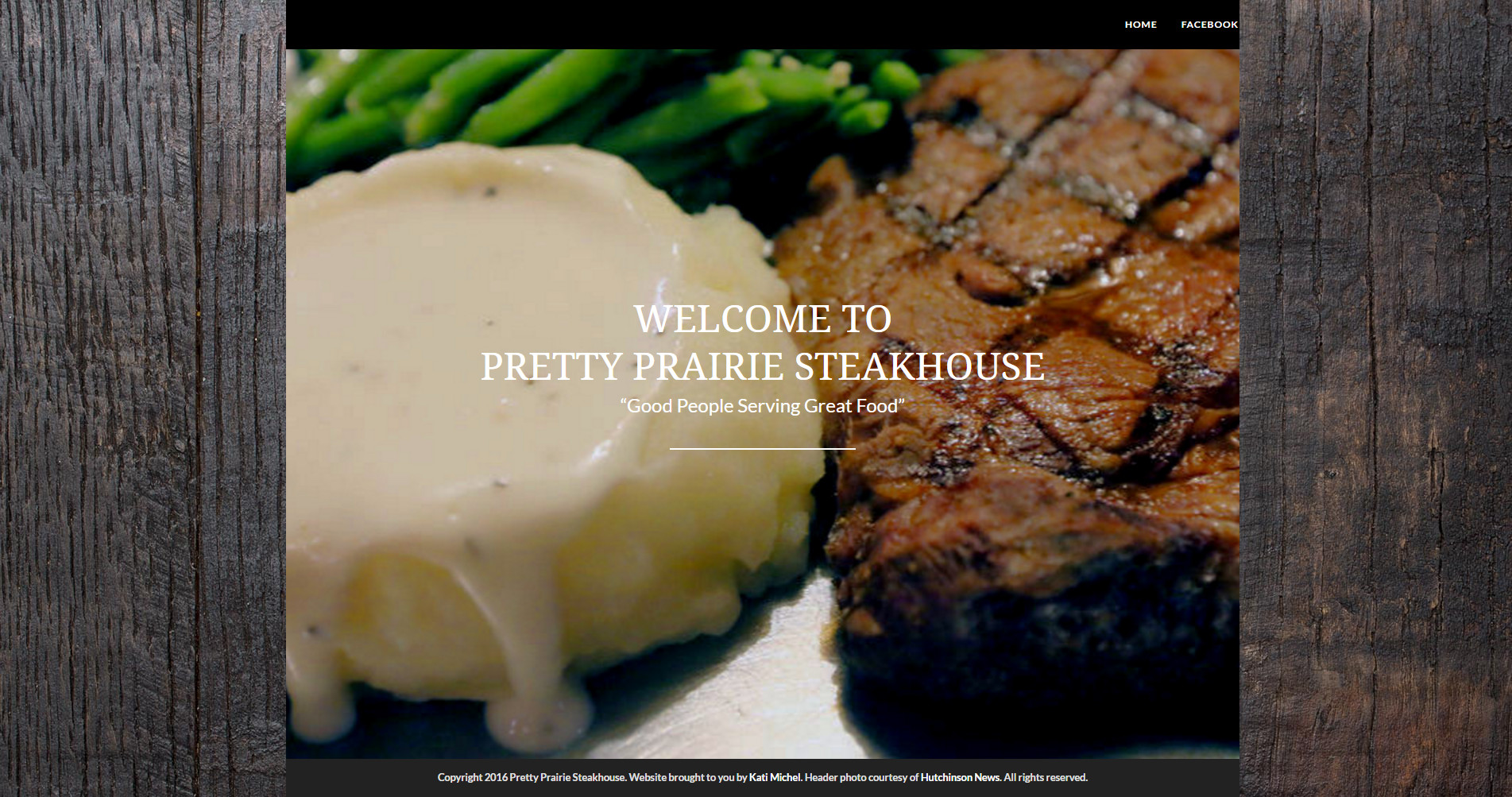
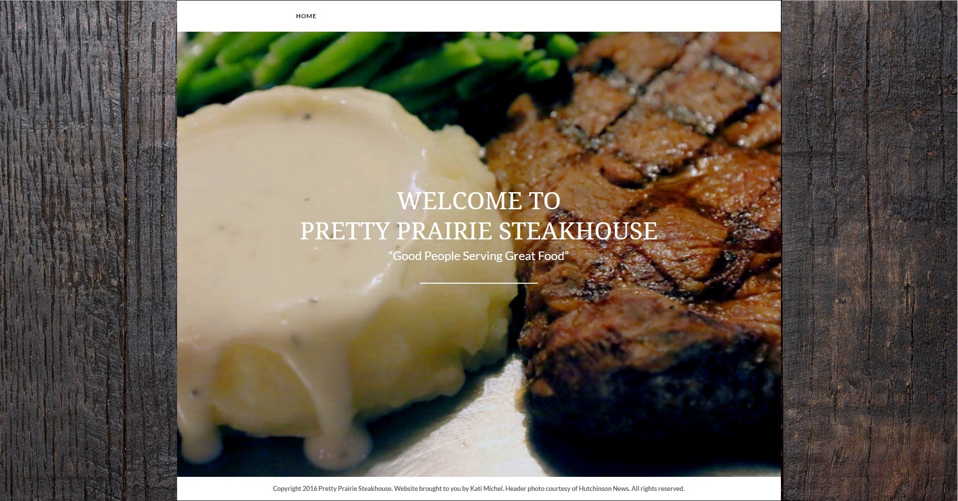
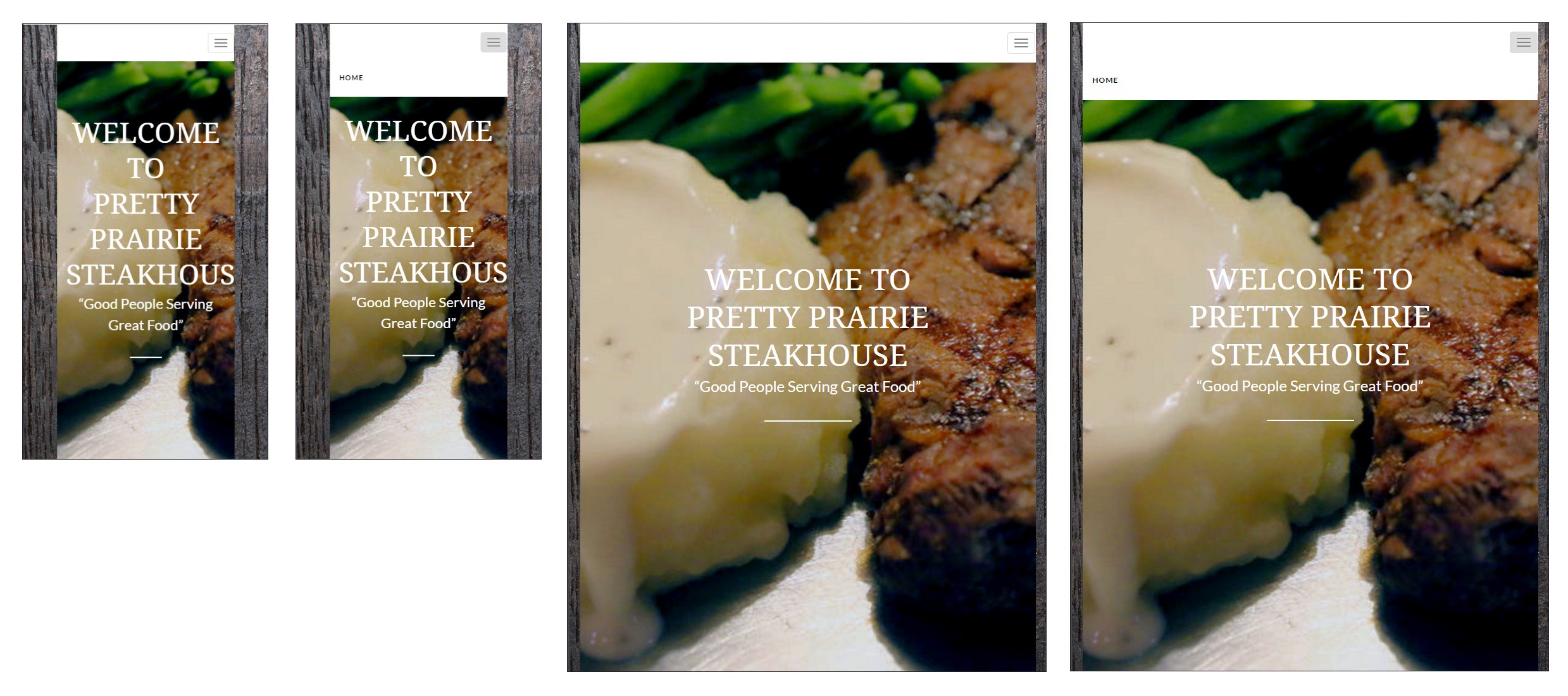
For the boxed version only, the layout is different on a large desktop than on a small desktop. However, based on current trends, I believe users are more likely to view the website on mobile, laptop or small desktop.
The header photo, which is used with permission of the Hutchinson News, was taken from a Hutchinson News story about the Pretty Prairie Steakhouse.
The large footer is left out of the mockups to save space.
Full Width
Small desktop- transparent navbar

Black Color Theme
Small desktop, iPhone, and iPad

White Color Theme
Small desktop, iPhone, and iPad


Boxed
Black Color Theme
Large desktop, small desktop, iPhone, and iPad

White Color Theme
Large desktop, small desktop, iPhone, and iPad

White Border
Black Color Theme
Small desktop, iPhone, and iPad

White Color Theme
Small desktop, iPhone, and iPad

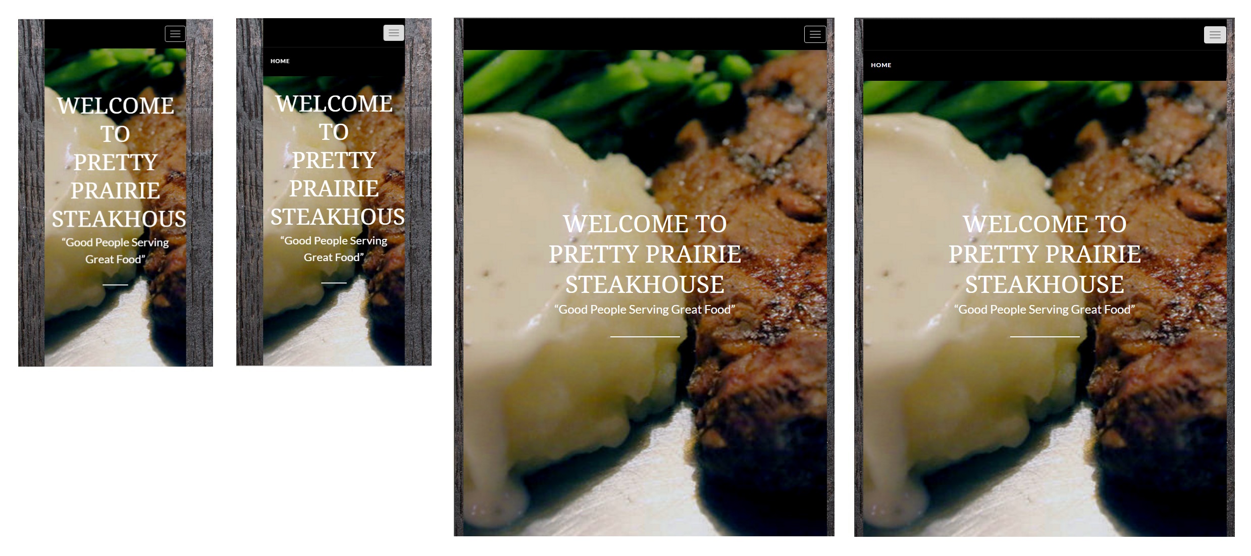
Boxed and White Border
Black Color Theme
Small desktop, iPhone, and iPad
White Color Theme
Small desktop, iPhone, and iPad

