Marketing Materials As Is
Summary
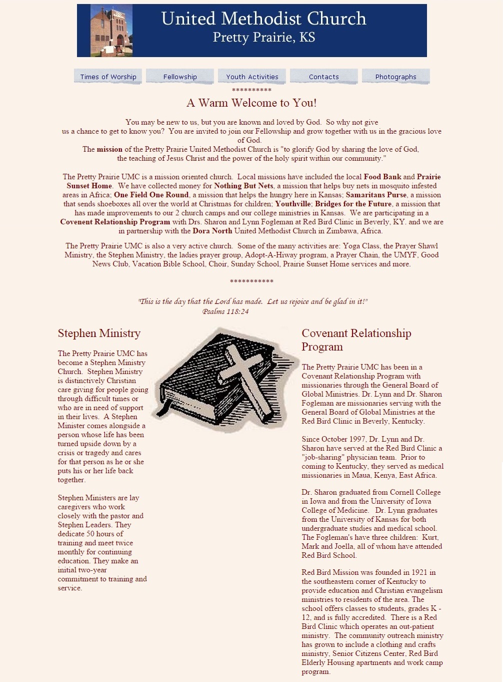
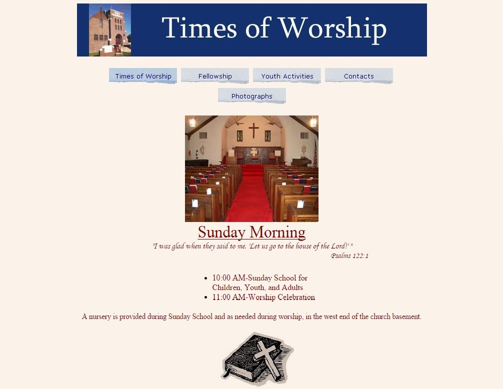
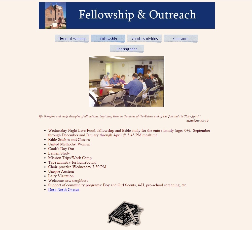
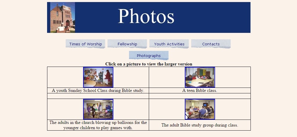
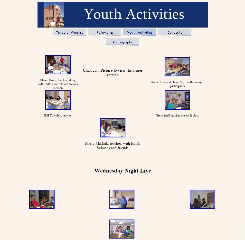
The old Pretty Prairie United Methodist Church website and marketing materials were created by different people, at different times, with no thought to creating one consistent church brand experience spanning all materials. Also, there was not a formal, coordinated marketing plan. See below for a critique of the old website, and screenshots of the old marketing materials.
Old Marketing Materials
Old Website

Mobile view
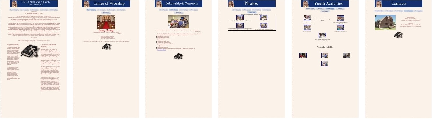
Pros:
- Straight forward design
- Use of photos and photo albums is positive, if only execution were better
Cons:
- Poor color choice (blue and pink are not complementary colors)
- Content not representative of full range of church demographics, groups, activities
- Wasted space (especially on mobile view)
- Ragged, antiquated looking menu bar
- The welcome page is a "data dump"
- Unnecessary use of clip art (should be avoided, if possible)
- Overly simplistic (and not aesthetically pleasing) photo album grid layout
- Lack of many modern features (blog, calendar, share/like buttons, video/audio, donations, messaging)
Note: lack of any social media presence (i.e. Facebook) although I do not know when this website was originally made
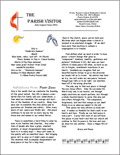
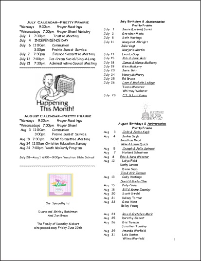
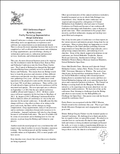
Old Newsletter

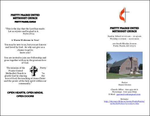
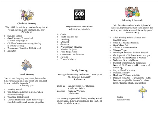
Old Brochure
Outside
Inside
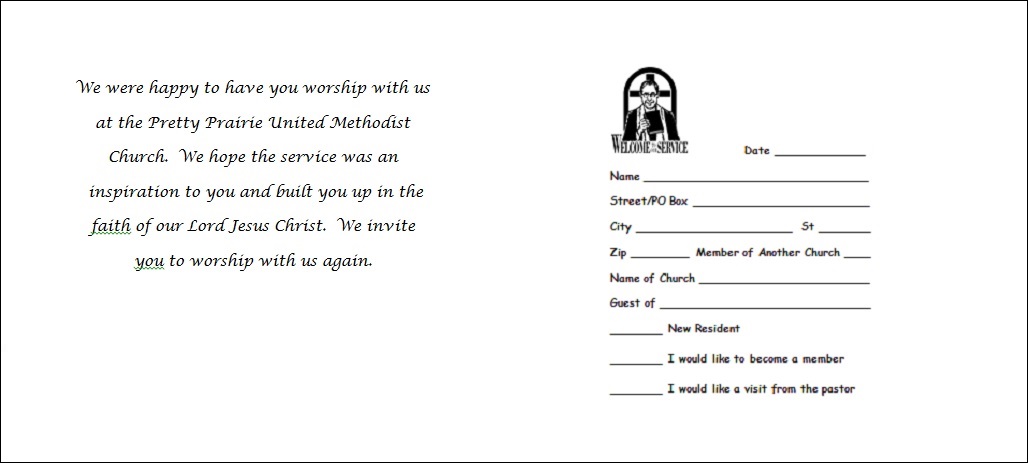
Old Visitor Postcards
Old Reminder Postcards

Old Update Cards

